A legacy poured into the future.

Context
Inniskillin, Canada’s original wine estate had fallen behind as newer competitors appealed to younger, design savvy audiences. We were tasked with reclaiming its leadership in the industry while staying true to its heritage. The repositioning as makers of the impossible became the catalyst for a confident refresh, drawing from Inniskillin’s 1970s heritage while evolving for the next fifty years.


What was done.
Art Direction
Brand Positioning
Visual Identity
Environmental Design
Packaging Design
Inniskillin is Canada’s original wine estate and a pioneer that changed how the world sees Canadian wine. Yet despite a history of accolades the brand had started to feel dated in a every-changing-market that appealed to younger, more sophisticated audiences.
The repositioning as makers of the impossible (crafted by agency Bensimon Byrne) set the tone for the new identity which draws inspiration from Inniskillin’s award winning 1970s era and the grit of being one of Canada's original start–ups. The design layers contemporary sophistication over this rich heritage, creating a brand that feels both timeless and fresh.
At the core is a simplified emblem an evolved I pillar that honours the winery’s two founders. This elegant anchor is paired with a flexible system of bold colour blocking, flowing curves and metallic treatments. These distinguish the Estate, Discovery and Reserve tiers while tying the range together.
Next Project
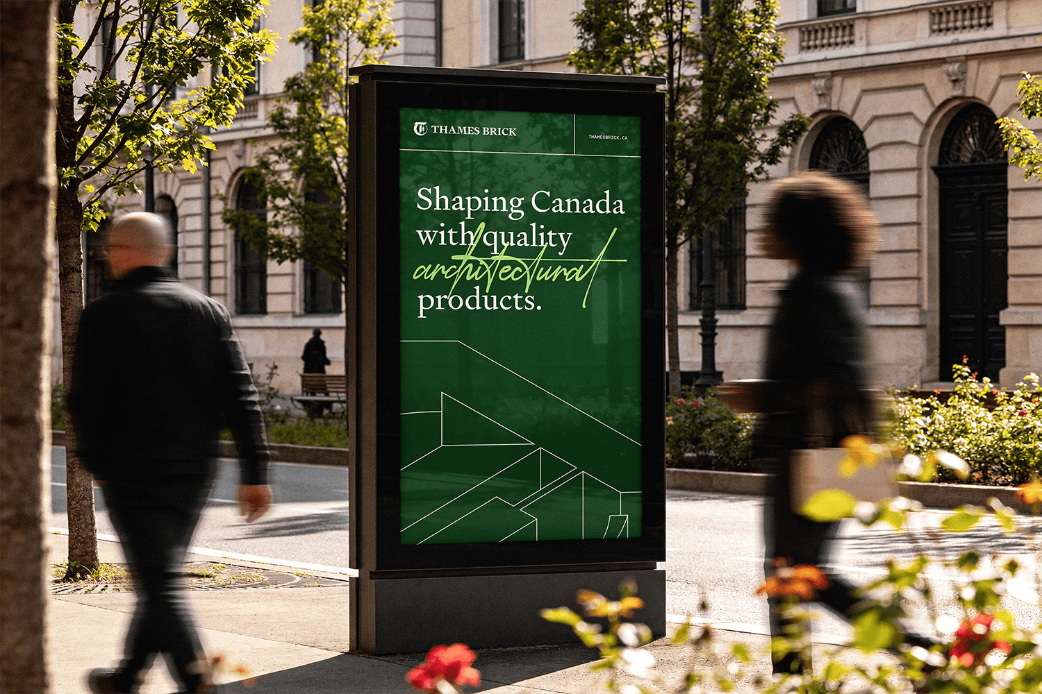
Thames Brick