A partner in growth.
Context
IntouchCX, a Canadian-born company with a global footprint, has long been the invisible backbone powering customer experience for Fortune 500 brands. But after two decades, the identity that once marked them as innovators had grown stale, risking being overshadowed by younger, faster competitors. The rebrand was an opportunity to shed the constraints of the past and reassert IntouchCX as a confident, forward-thinking leader in customer experience.


Branded House System
The brand system was designed as a cohesive family, unifying IntouchCX’s suite of software products under the master identity. Every element—from colour and typography to iconography—works together to create a sense of connection, ensuring that even the most specialised solutions feel intuitive, familiar, and unmistakably IntouchCX. It’s a system built for clarity and adaptability, so teams can innovate while staying true to the brand’s core.


What was done.
Strategy
Brand Positioning
Naming, Art Direction
Visual Direction
Copywriting
Visual Language
Environmental Direction
Website Direction
Communication Design
The evolution began with a name change from 24 7 Intouch to IntouchCX to refocus the brand on what truly matters: customer experience.
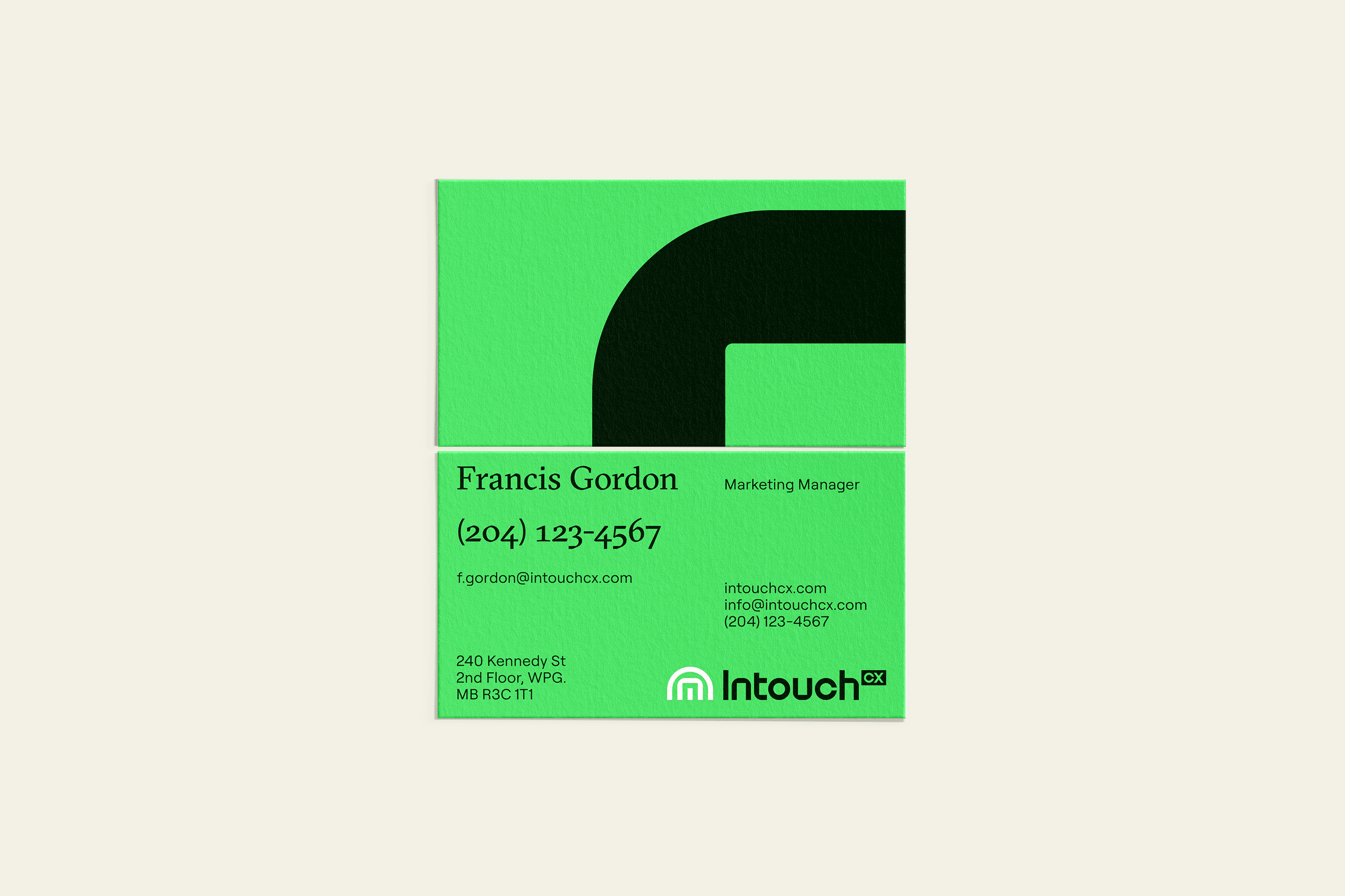
The new identity strikes a balance between angular precision and softer, human details. The icon doubles as a shelter, a symbol of trust and protection for both clients and consumers.
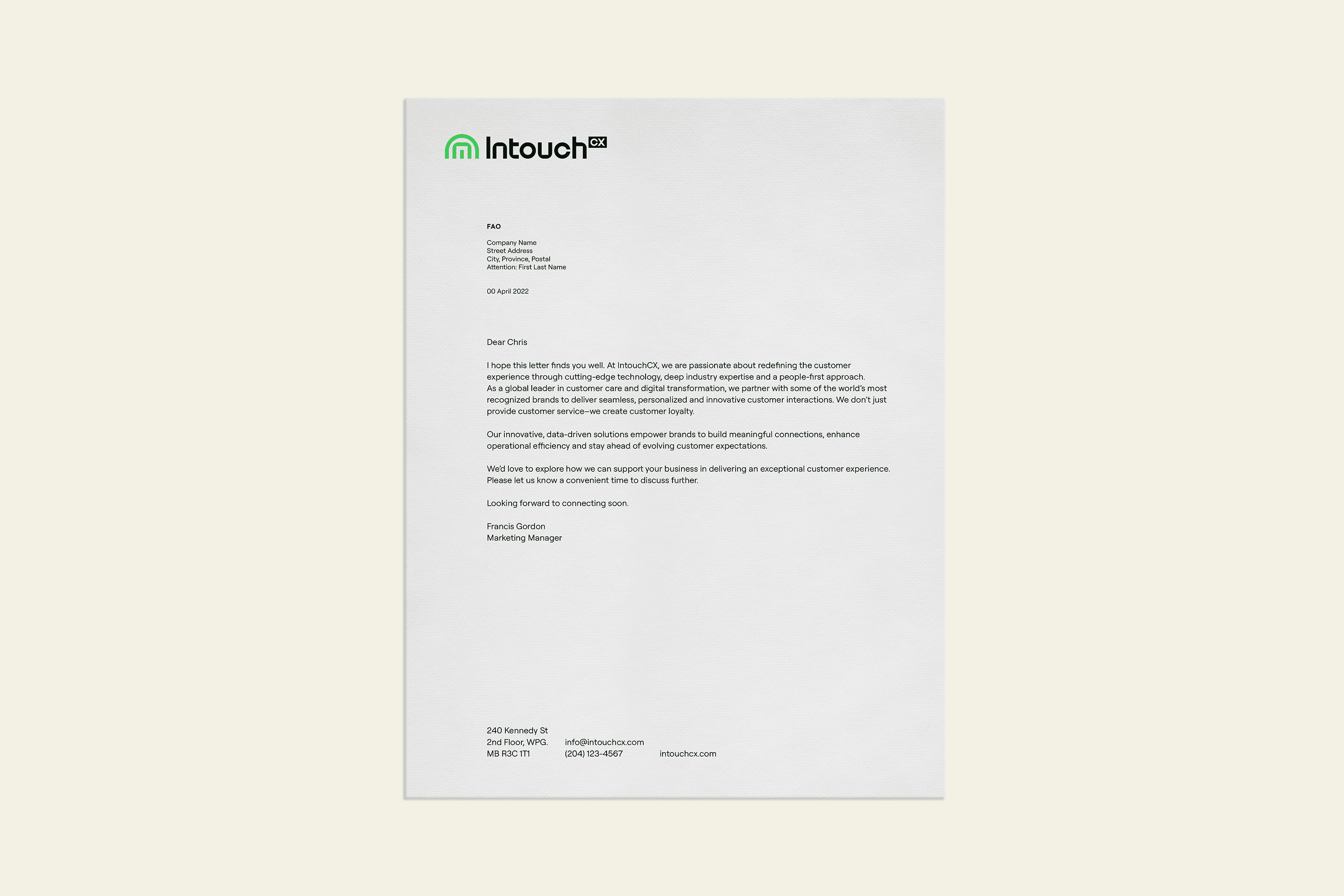
Every element colour, typography, iconography, the branded house system works in harmony to create a sense of connection. This ensures that even the most specialised solutions feel intuitive, familiar and unmistakably IntouchCX. The system is built for clarity and adaptability, giving teams the tools to innovate while staying true to the brand’s core values.
Next Project

MDA