Case Study

Case Study

MDA

MDA

Bold vision and Canadian ingenuity.

Context

For over 50 years MDA has been a symbol of Canadian ingenuity in space, responsible for iconic innovations like the Canadarm2. After years under Maxar the rebrand was about more than a new logo. It was an opportunity to honour MDA’s rich heritage while signalling its ambition for the future and positioning the company as a global leader in space technology. The directive was clear. How could MDA’s identity reflect both its storied past and its bold vision for what’s next?

What was done.

Visual Identity

Naming

Art Direction

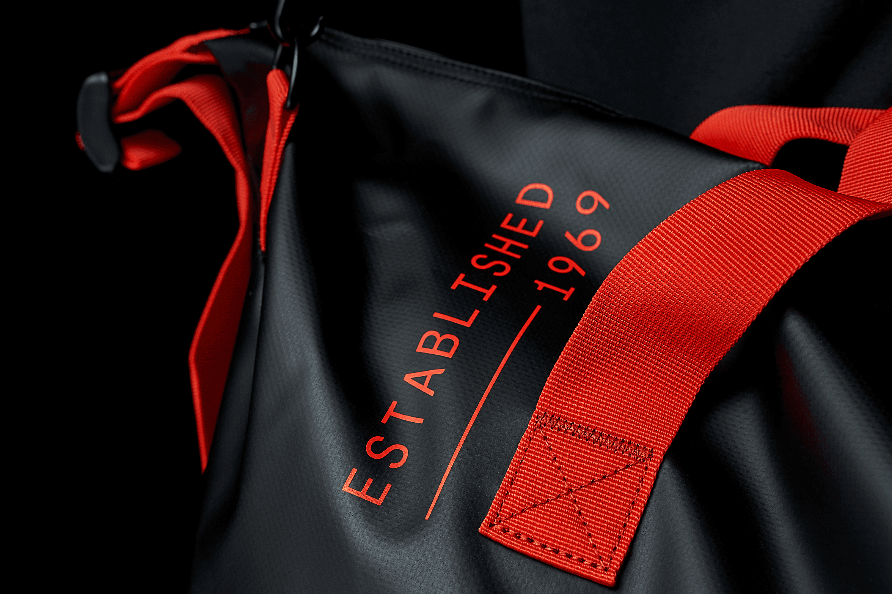
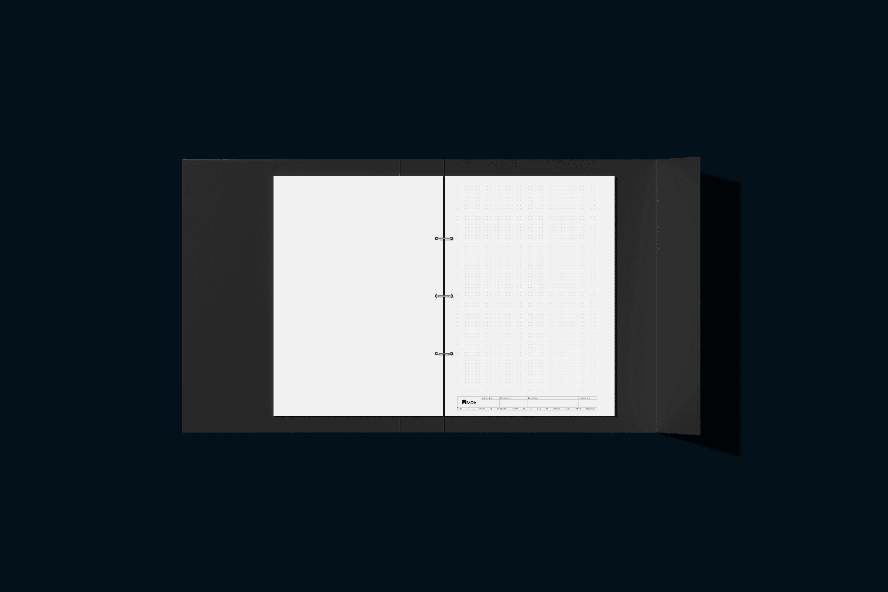
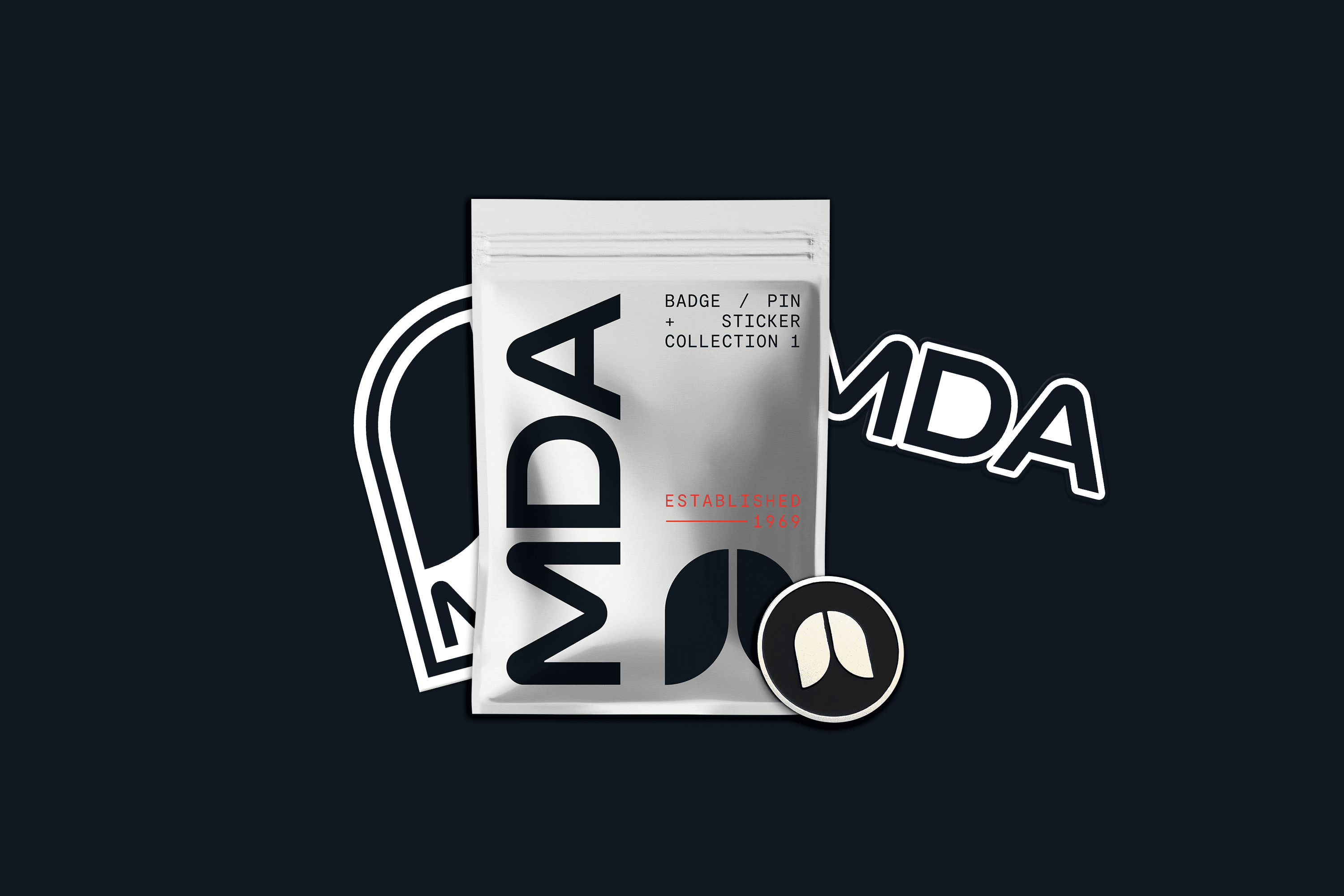
Merchandise Design

Environmental Design

Website Design

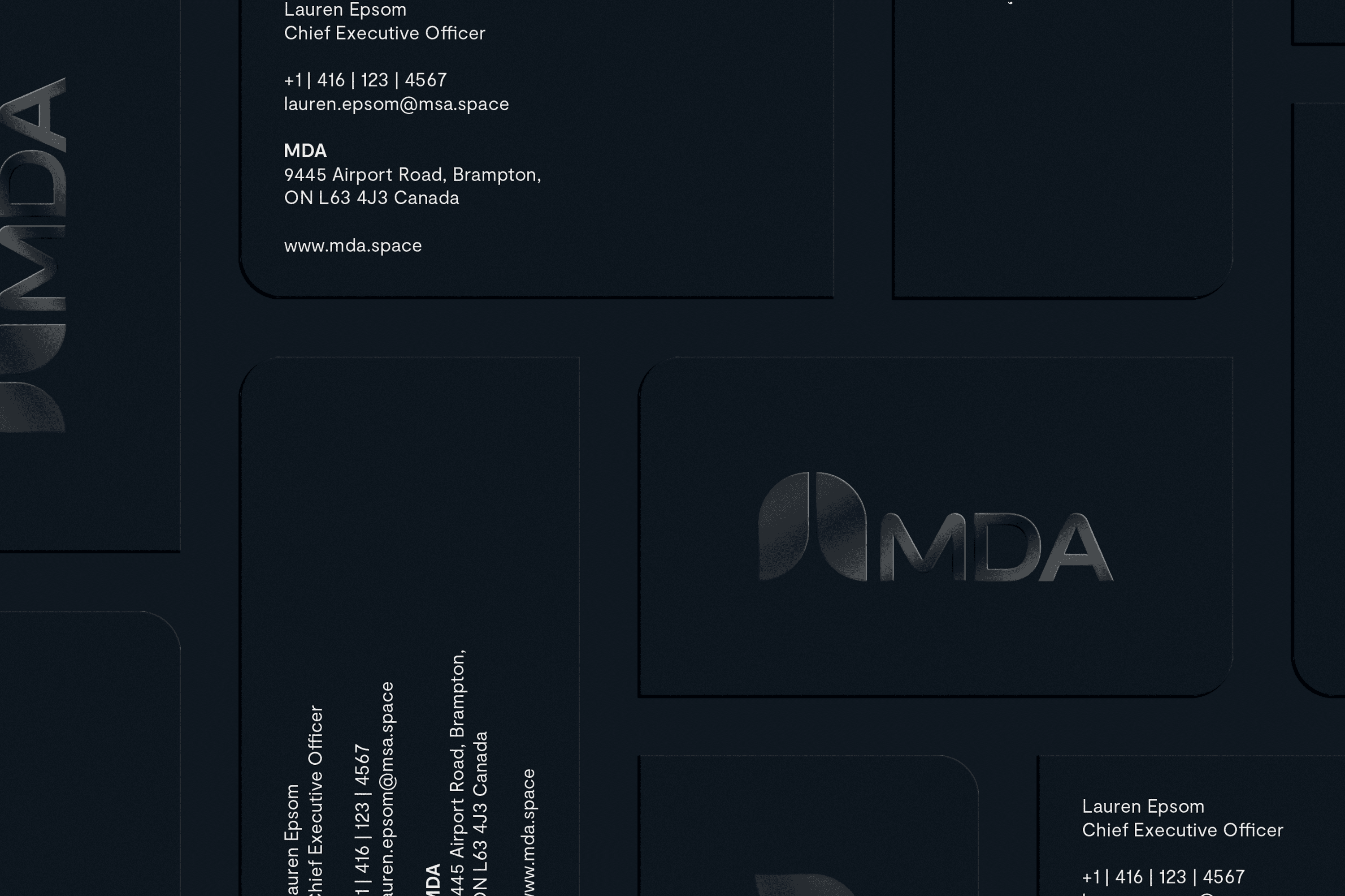
Inspired by Canada’s modernist era of the 1970s the new identity roots MDA in its national heritage while setting the stage for what’s next.

The icon a modernist plume evoking the departure of a rocket captures the company’s mission to push boundaries and take clients further than ever before.

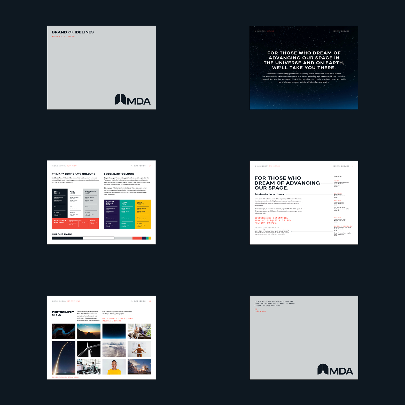
The visual system is built on a grid driven foundation, reflecting technical rigour and adaptability. Bold typography and a restrained colour palette communicate precision. The overall design language feels dynamic and aspirational.

The brand tells a story of heritage and ambition, reinforcing MDA’s position as a company that is proud of its past and clear eyed about its future: We’ll take you there.

Next Project

Kira

EDINBURGH GMT:04:42:41
TORONTO EDT:04:42:41

Designing together, no matter where.
Because great ideas shouldn’t
be limited by location.

Freelance Design since 2016

EDINBURGH GMT:04:42:41
TORONTO EDT:04:42:41

Designing together, no matter where.
Because great ideas shouldn’t
be limited by location.

Freelance Design since 2016

UK:04:42:41
CA:04:42:41

Designing together,
no matter where.

Because great ideas shouldn’t be limited by location.

Freelance Design since 2016

EDINBURGH GMT:04:42:41
TORONTO EDT:04:42:41

Designing together, no matter where.
Because great ideas shouldn’t
be limited by location.

Freelance Design since 2016